CalmER
A calming companion app for emergency room patients, reducing anxiety through information transparency and personalized support.
ROLE
UX Designer
TIMELINE
6 weeks
TEAM
6 members (PM, 2 UX Designers, Analyst, Tech, Generalist)
TOOLS
Figma, Miro
An older woman comes to the ER alone. A nurse takes her vitals and tells her to take a seat. An hour passes. Then another. No updates, no indication of where she is in the queue, no one to ask without feeling like a burden. Eventually she decides it's probably not that serious — and quietly heads home. The wait itself wasn't the problem. Not knowing was.
How might we help older adults feel informed and cared for during long ER waits — not just physically, but emotionally?
TL;DR — AT A GLANCE
Situation
Seniors in ER waiting rooms face 6+ hour waits with no updates — the uncertainty compounds anxiety more than the wait itself. 33 million seniors visit ERs each year, often alone.
Task
As one of two designers on a 6-person team, build the design system and co-design key UI screens for a mobile companion app targeting older adults in ER settings.
Actions
Built the Figma design system (components, colour, typography, accessibility specs). Co-designed screens around a 3C framework — Clarity, Calmness, Connection. Participated in research synthesis and ideation with the team.
Results
Top 3 finish in the Michigan Tech Innovation Jam Health Track. The design system enabled consistent handoff across a team that included non-designers.
✦ SITUATION
Designing for the emotional cost of waiting
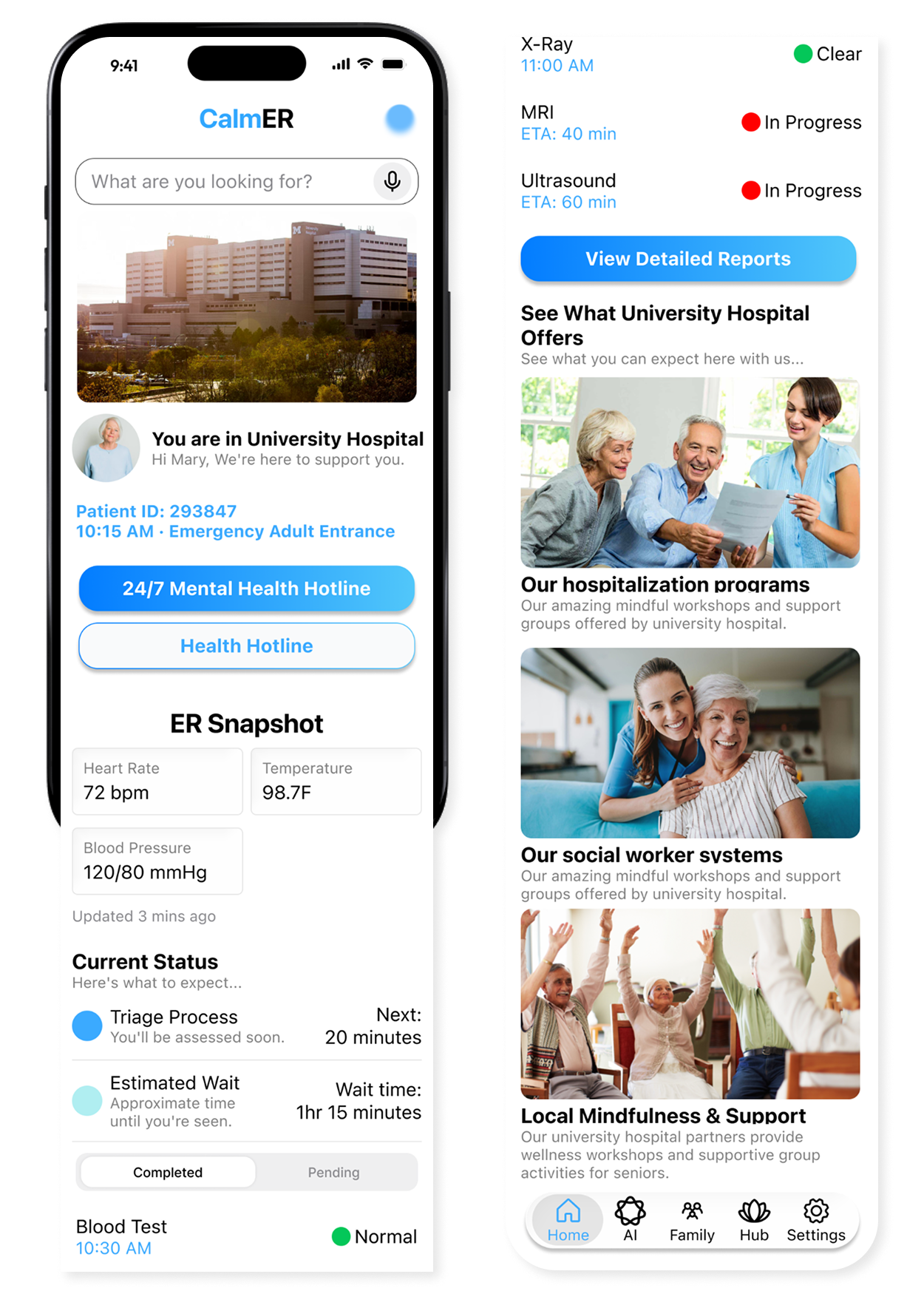
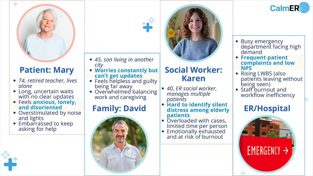
CalmER is a mobile companion app for older adults during ER waits, built for the Michigan Tech Innovation Jam in 6 weeks. The average ER wait is 6.5+ hours — for seniors who arrive alone, that time is filled with confusion, anxiety, and isolation. We weren't trying to shorten the wait. We were designing to reduce its emotional cost. And we designed for more than one user: the patient sitting alone in the waiting room, and the family member far away who can't get any updates.
Meet Mary
Mary, 74 — Retired schoolteacher
She came to the ER alone for sudden dizziness. She doesn't know what's happening, how long she'll wait, or who to ask. The nurses are busy. Her son David is in another city. She keeps looking at the clock.
"I just want to know someone is taking care of me."
The problem we focused on
- • 33 million senior ER visits/year — 21% of all ER visits
- • "Left without being seen" rate nearly doubled: 1.1% → 2.1%; seniors are 13% of those cases
- • Seniors waiting 8+ hours doubled from 12% to 20% (2017–2024)
- • Overnight stays increase in-hospital mortality risk by ~40%
Our design constraints
- • Can't predict or control medical timelines
- • AI cannot give medical advice
- • Must not add burden to already-stretched staff
- • Accessible for seniors with vision/motor impairments
✦ RESEARCH
What shaped the design
Given the 6-week timeline, we combined secondary literature (ACEP data, hospital satisfaction studies), expert consultation with a team member's medical contacts, and competitive analysis of existing patient apps — synthesized via affinity mapping.
Reassurance matters more than information
Older adults don't want a data dashboard — they need a gentle reminder they haven't been forgotten.
Uncertainty is the real stressor, not the wait itself
Not knowing what's coming next creates more anxiety than the wait time. Transparency is therapeutic.
Seeing a familiar face outperforms any status update
Family connection — even remote — significantly reduces isolation. This shaped our One-tap Family Link feature.
✦ DESIGN FRAMEWORK
The 3C Framework: Clarity · Calmness · Connection
Clarity
Stage-based progress instead of unpredictable countdowns. Clear language at every step.
"When I know what's next, I feel less afraid."
Calmness
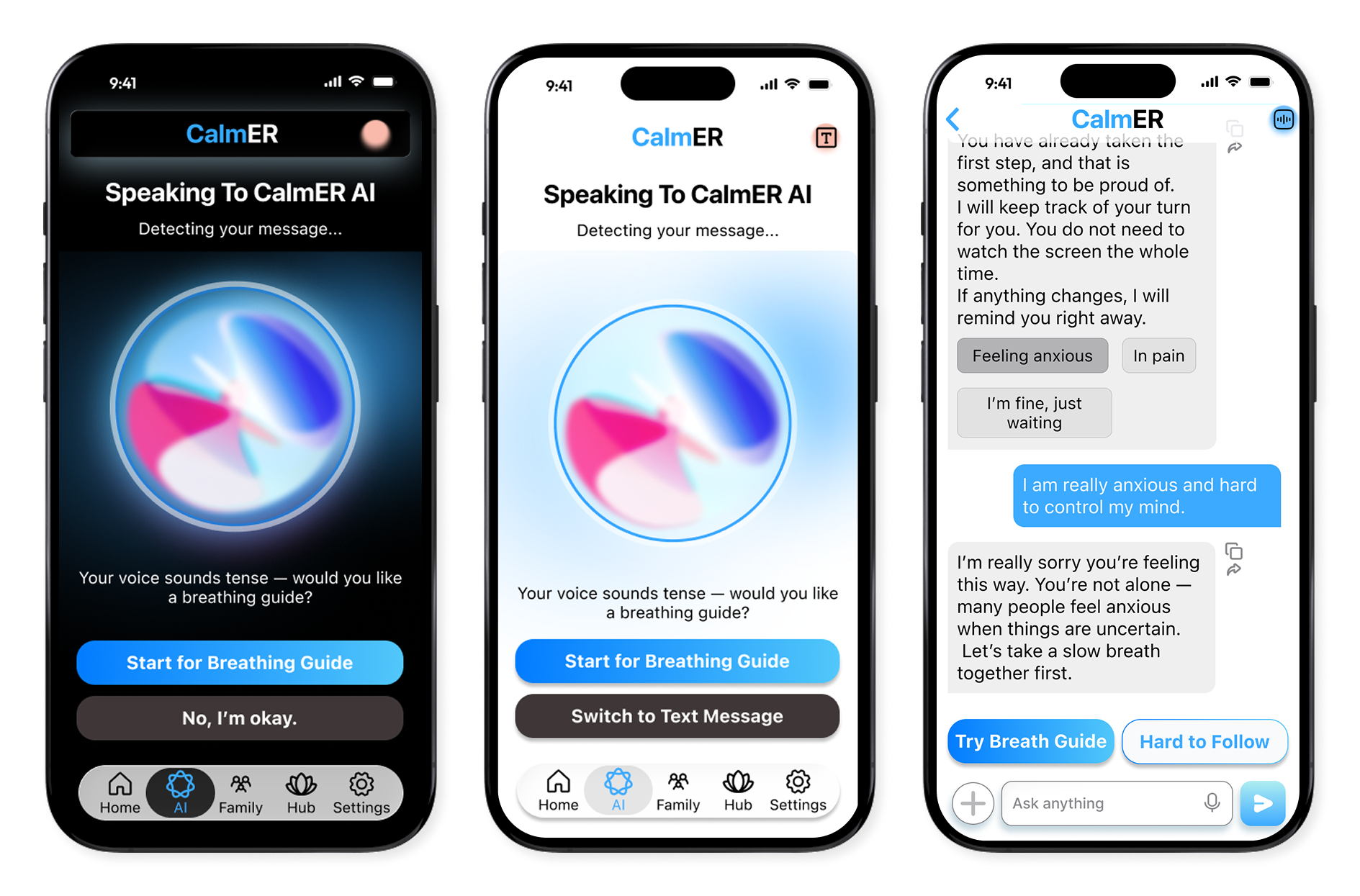
Soft colors, breathing guides, and an AI companion that supports — not advises medically.
"It feels like someone is there with me."
Connection
One-tap family video call. Real-time status updates for remote family members.
"I can see my son's face. That helps more than anything."
✦ KEY FEATURES
Four features, one goal: make waiting feel human
AI Emotional Companion
Calming conversations, breathing guides, medical term explanations — voice or text.
Empathy = Calmness
Smart Hospital Sync
Live triage updates, stage-based timeline, simple language explanations of what's next.
Clarity = Calmness
Instant Family Link
One-tap video call + automatic status sharing so remote family stays informed.
Connection = Comfort
Resource Hub
Breathing exercises, ER FAQs, social worker access — turning wait time into grounding time.
Support = Stability
Try the Interactive Prototype
Full emergency response flow in Figma
✦ ACTIONS — DESIGN SYSTEM
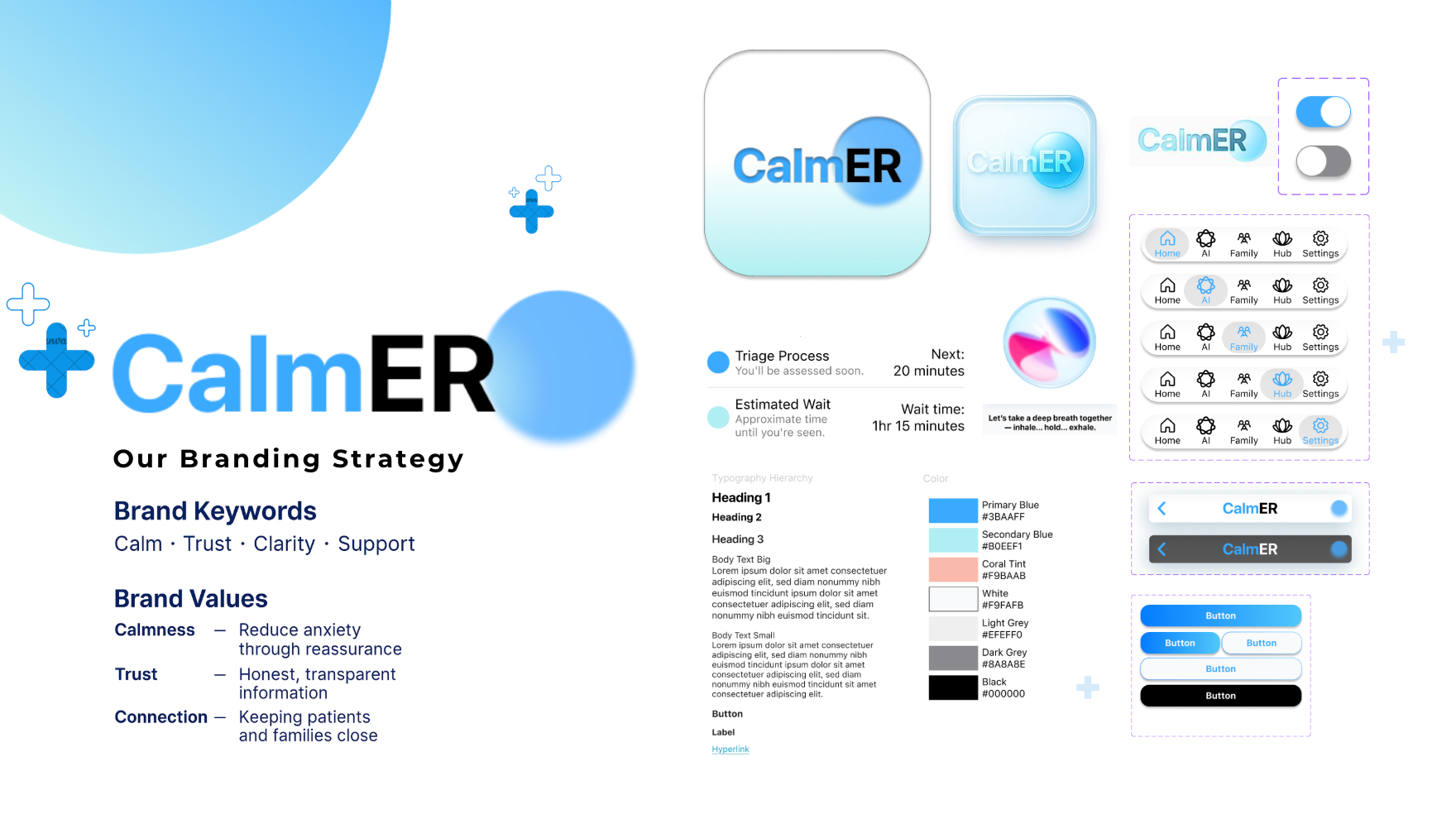
Building the visual foundation
I built the Figma component library from scratch — colour tokens, typography scale, button states, navigation bars, and list items — with accessibility-first decisions throughout. Large tap targets, high-contrast text, and minimal cognitive load were built in from the start, not added later.
✦ RESULTS
Health Track Top 3 — Innovation Jam
CalmER was recognised as a Top 3 project in the Health track at the Michigan Tech Innovation Jam. The judges highlighted the emotional design approach — specifically the 3C framework and the decision to prioritise video calling over text updates — as standout contributions.
33M
Senior ER visits/year addressed by CalmER's design
6 wks
From problem to hi-fi prototype in a competition sprint
Top 3
Health Track, Michigan Tech Innovation Jam
✦ REFLECTION
What I learned
This project changed how I think about emotional design — it's not decoration, it's a functional requirement when users are scared or in pain. Three decisions stood out:
Stage-based timeline over countdown
"Triage Complete → Lab Results Pending" reduces anxiety more than "est. 2 hours" — predictable process beats unpredictable time.
AI as companion, not doctor
Positioning the AI as emotional support rather than medical advisor maintained user trust while keeping us within safe, honest boundaries.
Video over messaging
Seeing a familiar face has disproportionate emotional impact compared to text updates — so we built one-tap video instead of a status dashboard.
Next step: usability testing with actual seniors in ER waiting rooms, and piloting the AI companion with real hospital system integration.