Sceneo
A mobile app concept designed to make attending live performances easier, clearer, and more social.
ROLE
UX Researcher & Designer
TIMELINE
Aug – Oct 2025
TEAM
Solo Project
TOOLS
Figma, Personas, Journey Mapping
✦ OVERVIEW
The Problem
Sceneo is a simple theater-finding app for students. It helps them discover shows, preview seats, and plan outings with friends.
I worked as the UX Designer and Researcher. I used Figma.
Problem statement: Students who want to attend musicals or plays want all events in one place with clear seat and venue tips, and the option to go with friends — so they can choose shows that fit their interests, budget, and comfort.
I conducted 3 semi-structured interviews with student theater-goers before starting the design, asking about their process for finding shows, choosing seats, and coordinating with friends. I also drew on my own experience as a regular musical attendee to pressure-test findings. Themes were synthesized into the problem statement and the persona work below.
✦ RESEARCH & GOALS
What students needed
Students want quick clarity when planning a show:
- What is happening near them?
- What seats are worth buying?
- Which shows their friends recommend?
Making all of this simple reduces uncertainty and helps students enjoy events instead of stressing about logistics.
Key pain points
- Hard to compare shows in one place
- Seat quality is unclear
- Friends' opinions are scattered
- Hard to share ticket costs
Design objectives
- Give clean show previews with modern layouts
- Provide visual seat views to reduce guessing
- Show friends' activity to support social planning
- Make sharing ticket costs simple through Venmo-style flows
I created two personas, Melissa and Daniel, based on formative research. Both represent students who like going to shows but value convenience, clarity, and social planning. I also built a user journey map to understand their emotions and decision points.
✦ DESIGN DECISIONS
Design & Iteration
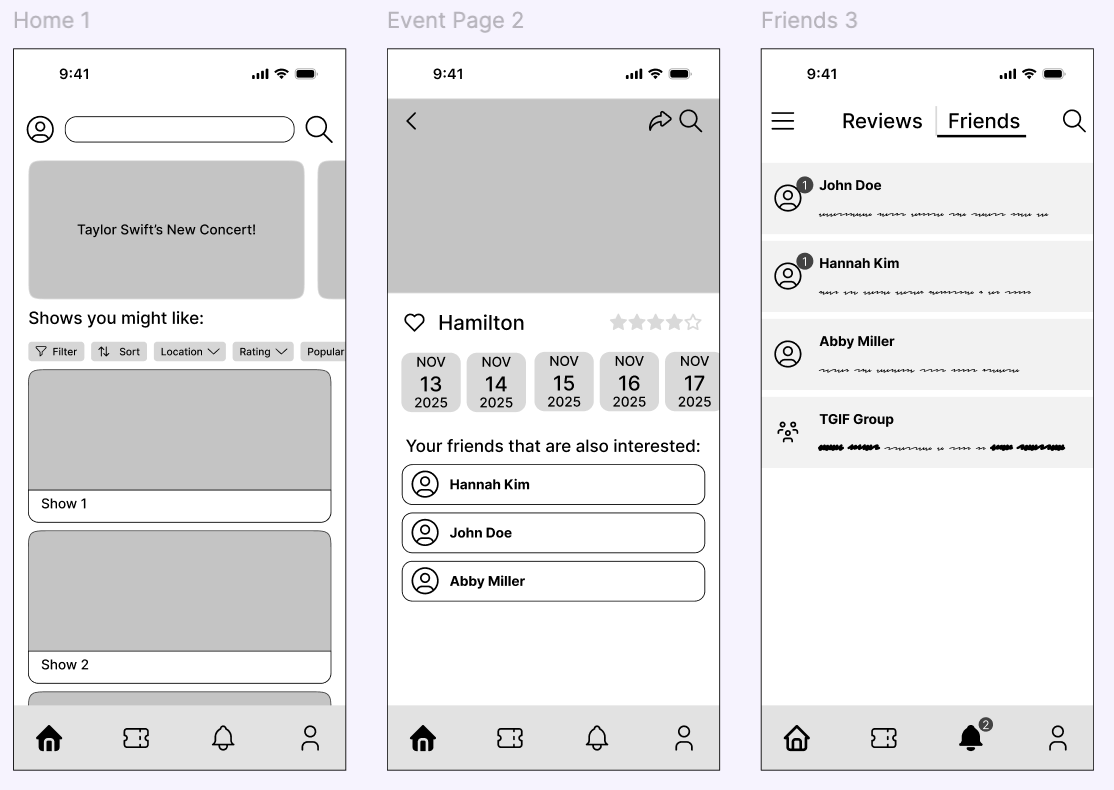
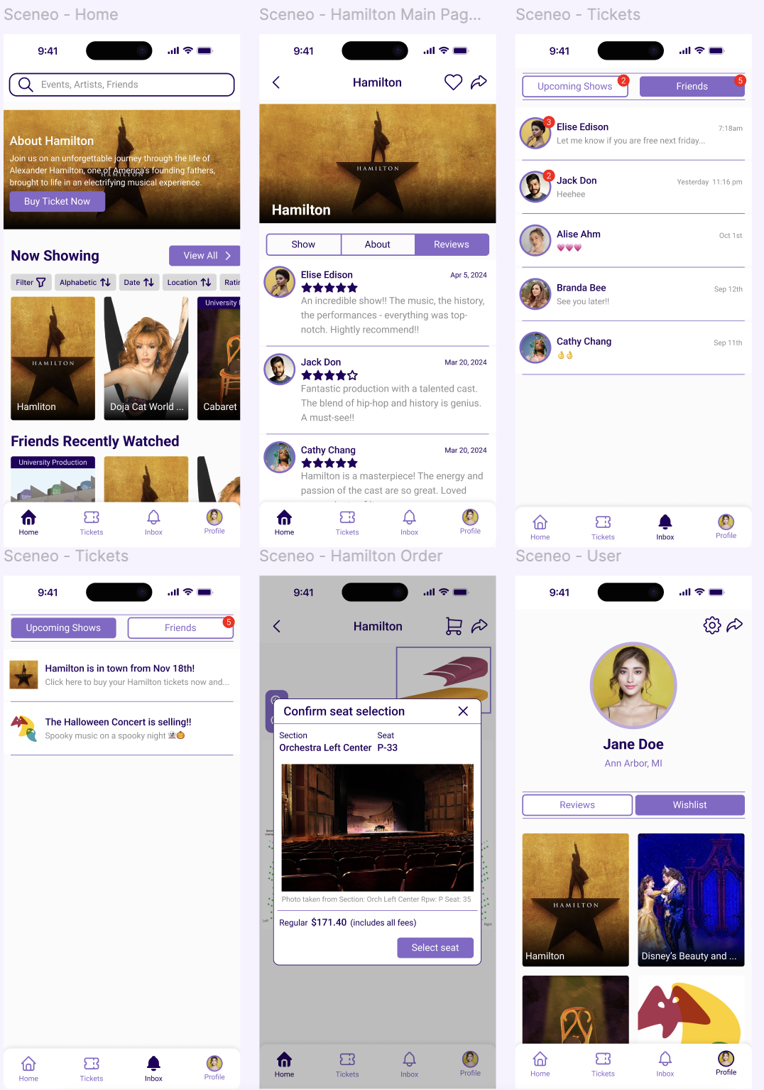
I used a modern, clean visual style with more spacing, rounded elements, and updated card layouts. This made the design feel lighter, clearer, and more student-friendly. The purple accent color helped highlight important actions without feeling commercial.
Lo-fi Wireframes

Iterations from feedback
Feedback 1 – Card clarity and modern style
I learned from Joseph that the card layout felt outdated and cluttered. I redesigned the card grid to be cleaner and more modern.
→ Result: updated cards with clearer images, spacing, and hierarchy.
Feedback 2 – Add age/PG rating filters
Elizabeth said families and non-traditional students need age filters. I added a PG/age rating option to the filter bar so users can easily find shows that match their needs.
→ Result: clearer filtering + better inclusivity.
Feedback 3 – Improve spacing and visual consistency
Josh pointed out that text sizes and spacing felt inconsistent, and the "Present Box" looked too sharp compared to other rounded elements. I increased text size, adjusted spacing, and made the box rounded.
→ Result: a more polished and unified design.
Hi-fi Wireframes

✦ RESULTS & REFLECTION
Outcome & Reflection
Try the Interactive Prototype
Experience the full user flow and interactions in Figma
View PrototypeAfter revisiting the PRD, I simplified the "friends reaction" feature, improved Venmo-style cost sharing, and made the seat preview load faster. These changes made the app feel smoother and more realistic for student use.
I learned that even entertainment apps rely heavily on trust and clarity. Simple visual fixes—like better spacing and seat previews—can remove a lot of user stress. Feedback helped me see the gaps in hierarchy and consistency, and user research showed me how social planning plays a big role in students' decisions.